This posting is a reminder to myself to keep these inspirations in mind if I ever find myself without a border, or a filler for in-between pictorial elements, or just for and all over design. You've seen some of the pure design elements in my photos from the National Portrait Gallery and from Montreal so hold on to your hats for design ideas from the Corcoran.

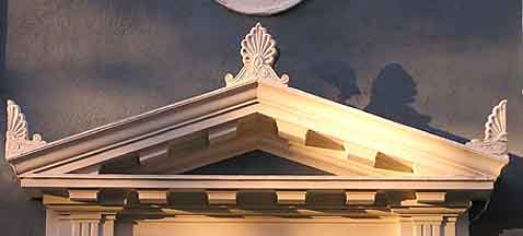
This is a very fine example of acroteria (information below is from http://buffaloah.com/a/DCTNRY/a/acro.html ), and I thought how lovely they would look (in modified form, of course) as a border on that special quilt. I am sorry to say that I did not get the documentation for the painting that is seen directly behind this architectural delight (which, by the way, was part of a very imposing staircase in the Corcoran Gallery, and yes, I did say "staircase"). I thought I had, but it's not on my camera. No failure with technology; it lay solely with the operator of said camera.
Acroterion (Acroterium)ac row TAIR ee onPlural: Acroteria
Architecture
1- Blocks or flat pedestals resting on the apex and on the lowest ends of the pediment to support statues or carved ornaments.
2- The term is sometimes applied to the carved ornament itself, which resembled a stylized palmette.
Greek: "acroterion" - the summit or extremity
Found in classical Greek and Roman architecture and derivatives
Furniture
In English and American 18th-century furniture, the acroteria refers to the end blocks of the pedimented top of a secretary or bookcase, or the central block in a broken pediment which might hold an urn, vase, finial, or other ornament.

This is a plaster adornment in the center of a dome also in the Corcoran from which clearly something (huge chandelier?) could be suspended. What caught my eye was the radiating design of shield with an intersecting spoke and leaf (heart). Each succeeding shield gets larger and ends with a double ring pierced by the final shields spoke. Note that the innermost ring is wider than the next two, and the outer is the widest of all. The center circle with leaves is a softer, more organic shape than the more stylized shields. Anyone for a center medallion challenge?


Now this painting is here first for purposes of quilt design and second because I really admire the graphic simplicity of the work (documentation provided). Three colors and then that unexpected, tiny splash of pink/red tongue. This is a triadic color scheme (colors that are an equal distance apart on the color wheel) blue, yellow, red. They aren't complementary because they are a color away from their complement (blue and orange are complements with yellow one step away, yellow and violet are complements with blue a next door neighbor, and red's complement is green). The point is how well it works. and it isn't the expected combination. So take the color wheel, draw an equilateral triangle and try a table mat using those colors you landed on to see how you like it.

I've mentioned before how much I love quilts with houses, but I never thought of "row houses" embellished with words and symbols. It's too bad I chopped off the peaks of these buildings, but oh, my, don't you love the appearance of wood slats? This is a very simple form that can be embellished with just about anything that is important to the designer. Quite effective. Again, as with the painting above, note the colors used.

And finally, just for fun . . . if I ever think I have too much time on my hands and want to try an intricate pattern, how's this? Another plaster ceiling piece from one of the upstairs rooms at the Corcoran. Rumor has it that they might be moving from that building which would be a crying shame (I haven't shown you all of my photos from there - haven't even scratched the surface), but at least I have a few memories and some inspiration for those days when nothing comes to mind.
I really like both of the white pieces. I wonder how it would be to applique a white design on top of white? At least you would be able to see it better than black on black! Where is the Corcoran?
ReplyDeleteI really love Rubert Garcia's silkscreen. The simplicity of that print is a knock out. I mentioned trying to use a limited palette in my watercolors recently. I have not had the vibrant success of this work as I have not simplified my compositions. But it's fun to try to see what colors you can create with only a few basic paints.
ReplyDelete