Sunday, May 31, 2015

Stourhead Stable

Well, what did you expect?  No one offered a better name for this painting so I was left to my own devices.  Does it look like a stable?  No, actually it looks more like a garage for elegant early automobiles, but the word "garage" doesn't actually trip lightly off one's tongue.  So "stable" it is - for now.

Day 3's work:


At this point - well, some things I like and some I don't - as always.  It's already overworked, but it isn't finished.  The copper beech that hangs over the building (whatever you want to call it), the bushes and the burn barrel need more work, and heaven help me I wanted to be able to do something about the bush on the left talk about overworked!) and the driveway.

Today's work is, I hope, the end even though I know Sharon will have suggestions to make it better.  


For example, the copper beech, and that's just for starters. 


Thursday, May 28, 2015

Stourhead Painting Days 1 & 2

The fact that we had construction-caused outages of our computer, television, and computer had an up-side.  It gave me more time for - yes, organizing, of course, and painting. But on Monday, I decided to draw and to use a "dip" pen which I don't think I've done since my college days.  A dip pen, as you've probably already figured out, is one that is actually dipped into a bottle of ink.  They are used by calligraphers as well as people who like to sketch.  Since it had been so long since I'd used one, I decided just to play.


 First, I just drew over the outline of the call box (telephone) already done in pencil; straight lines can be difficult for anyone using any implement, but it made a great way to start.  Fortunately, I had a very good nib (pen point) in a cracked but still extremely comfortable pen shaft, and quickly I rediscovered how good it feels to draw with this tool.  The practice was in straight lines (as in driving look where you're going not where you are) both long and short (call box and grass/weeds), curvy lines (tree and red flowers), and textured surface (tree trunk and stone wall).  I used India ink which is both waterproof and fade resistant, but the downside is that it doesn't flow.  One cannot make a wash with it.  Ah well . . . one can't have everything.

Tuesday was studio time, and I was able to get started on the Outbuilding (I could really use another name for this painting; anyone have an idea? please let me know!).


Not too exciting at this point.  The roof is almost a disaster except it's only the first wash.  That means that I might be able to do something about it.  I did like the start of the trees in the background; they have promise.


Today I feel better about the roof, still like the background even though it's not finished yet (though nothing really is at this point), but now the bushes in the left foreground and on the building itself need help.  

Oh, the yellowish dots in the tree overhanging the building?  Don't worry about them; they're masking fluid that can be removed when I'm ready to add the red for the copper beech.

Thursday, May 21, 2015

Experiment with "Blind Contour Drawing"

Sharon sent us a link to an interesting article:

http://www.nytimes.com/2015/05/17/magazine/letter-of-recommendation-blind-contour-drawing.html

It makes good reading, and I remembered doing this exercise years ago.  As I remember, the experience was fun so I thought it would be worth trying again using a window sill in the family room as my subject:


Unwittingly, I included an additional restriction; I did not raise the point of my ballpoint pen from the paper.  So the following was completed without looking at the paper and without raising the point of the pen.


Here is my continuous line, blind contour drawing, and I love it!  As the article suggested, I find this sketch so unlike my own work that I feel quite liberated - as though it were done by someone else, I can comment on it objectively.  Unlike the author of the article, I don't find this work ugly.  On the contrary, I like it quite a bit.  It looks like Cubism, doesn't it?  I would not have been able to do this without the freedom this exercise gave me.

Now, will I do it again?  Yes, because I find the results interesting and because it is freeing.  I do look carefully at the relationships between objects differently.  Do I get a Zen-like feeling about the objects?  No.  Or maybe just "not yet".  I think I will add this to the studies I do and see if it makes a change in my work. 


Wednesday, May 20, 2015

Stourhead Study #4

After a walk which at one point turned into a run (we saw the garbage truck - four to five hours early coming down the street, and we hadn't put our bins out yet), we took care of errands and had lunch.  D then got caught up on computer work while worked in the studio.

But I did get to painting practice today.  It is silly of me to call these "wash" studies because I haven't really been using much in the way of large watery paint areas - or washes.  My studies are too small to do much more than work with a few watery puddles.  Anyway - today's work:


Not what I was hoping for, but I realize that I learned a few very good lessons.  Here a just two of them.  First, as Sharon told me, it really isn't wise to use pieces of watercolor paper that have already been used so I wind up using the wrong side of the paper (yes, there is a significant difference), nor is it wise to use inferior paper.  I made both mistakes.  Because of that, there is no light in my final study; it was like working on drawing paper.  Oh well.  Tomorrow I'll cut up a piece of my good paper; that's hard for me to do!

Second, because I started the roof with alizarin crimson, the copper beeches ( left side and right top) aren't going to work.  The roof is too warm especially if I'm going to include copper beeches and maybe even if I don't put that kind of tree in.  

I'll have to think about that.


Tuesday, May 19, 2015

Stourhead Studies 2 and 3

Painting class was time well spent for me and for the two others who are the only others who made it to class today.  A is working on several studies of an eagle, and they all look very promising.  Sharon shared the work of a watercolor artist (check out her website www.jeanhaines.com/gallery ) who does some really fine, loose watercolors with bold and unique colors.  J is completing studies for a very complex still life with many pieces of silver.

And I worked on two more studies for my painting.   They are all on taped on the back of my drawing pad which is made of amazingly sturdy cardboard.  The one I posted yesterday is on the lower left.  The first one I did today is on the lower right.  I wanted to work on the limestone from which the building was constructed and the colors for the doors (the first blue wasn't purple enough) and roof.  You'll note that I didn't pay much if any attention to the actual shape of this building; this one looks very boxy - perfect for today's purpose.  The more periwinkle color is what I hoped for, and the yellow ochre limestone, while more intense than in the photo, gives the warmth I want.  The shaded portion of the building off to the far right appeals to be an older section. The stones incorporated in the wall are larger than in the rest of the building.  In the "newer" portion, I used some gray to indicate the stone work, and while I don't care for the way I did that, I like the gray.  The ridge of the roof is a good warm color, but the roof itself doesn't have the right cool tone it needs.


The last one I had time to try out is in the top right hand corner and makes use of a drawn building.  My intention in this one is to double check the colors and methods I like, to get the roof right, and see that all goes together well.  And, I hope it will build "muscle memory" which will help me make my brush strokes deliberate instead of tentative.  If it doesn't work for this painting, maybe it will for the next.  I know what regular practice can do in other areas, but I, fool that I am, I haven't applied it in this one.  

The  final test paper?  Just in case it's needed, and knowing me, it very well may be.  More practice is worth the time it takes.  Why does it take so long to remember something one has already learned?

Monday, May 18, 2015

First Watercolor Study of Stourhead

This morning there were more plants to get in the ground than I realized, and some that I thought weren't going to be planted yet but were included because I just changed my mind.  That lovely rose and fourteen others were planted, and I feel a great sense of satisfaction.  Completed a task feels good.

What makes me even more pleased with my day is that I also managed to prepare for tomorrow's painting class. That entailed tracing the Outbuilding drawing on to watercolor paper.  Not an exciting task - especially when I thought I hadn't placed the building where I wanted it on the paper, but that turned out not to be the case much to my relief.  What pleased me the most was having the time to set up and do a preliminary wash study.


Before starting this study, I quickly sketched an approximation of this building on two other pieces of paper.  Then I decided just to start a study without a preliminary sketch reasoning that I needed to figure out how to lay down the colors and also what colors I might want to use.  When I mistakenly dipped my brush into a dark red, I decided to go ahead and try it.  As I thought and you can see on the right hand side of the building, it made the shadow too warm.  

I have to do more studies, but at least this is a start.

Sunday, May 17, 2015

Weekend Doings

What a weekend!  Good friends came down for the weekend.  We went to the Lupine Fest at the Pinebush, attended a talk on the significance of Grant's (as in Ulysses S. Grant) Cottage, ate ice cream for supper, and went to a concert at the Linda.  And that was just Saturday!

Did I do any wash studies as I had planned?  No, I'm simply too tired tonight to work on that (I even dozed off during the 6:00 p.m. news which I rarely, rarely do).  What I did do was more planting in the front yard.  Again, I'm taking a risk, but - fingers crossed - the colder nights should be past.


Our daughter gave us this wonderful big white planter last year, and it was fabulous in the copse of oak trees that is in our front yard.  I like to take a picture of it when it is first planted (which I did last weekend)  so at the end of the season I can see how it has changed,  That way I can tell what works and what doesn't.  This year I've done pretty much the same thing I did last year, but this time I used fewer coleus plants and no sweet potato vines (they weren't out when I purchased the other plants).  I think those changes will make a significant difference - on the minus side.  My guess is that not having those plants will diminish the look due to lack of strong contrast.  We'll see.


And here is the smaller white planter Daughter gave us this year.  Since I planted it today, it includes a white geranium (an experiment as I'm not a real lover of geraniums as specimen plants), a few white petunias to carry the planting over if the geranium decides to stop blooming for a while, sweet potato vine, and a new plant - ornamental millet (the two spiky plants - no room for three). Over-planted? oh yes, but . . . I like planters to be exuberant, to spill over.

Now I have only a rose bush and red day lily to plant.  The rose is my favorite Blanc Double de Courbet and will go in the front on the berm.  Right now it's on the patio in back, and every time I go out there, its sweet subtle fragrance reaches out to me.  Its white blossoms look like a lady's hankie folded over in her hand.  Can you tell I like it?  The day lily will go in the day lily border on the side of the house, and that will be it until we get the back gardens cleaned up.

Those practice watercolor washes?  Tomorrow is another day.

Thursday, May 14, 2015

Stourhead Photo Revisited

E mentioned in a comment on the value study I recently did, that she didn't remember the building at all and would I mind posting it some time.  Although I sent her the photo in an email today, I realized that she would not be alone in not remembering it.  It has been a year since our trip to England and there were a lot of images posted in this blog.

As we took the path that led out of Stourhead Gardens proper up to the area where the bus waited for our tour group, D and I again saw the "maze" on our left that we had noted on our way in, but this time it had a visitor - make that two visitors:


A little red-haired girl and her red and white Cavalier King Charles Spaniel were have a great time running through this maze.


As we passed that spot, on our right we saw this structure.  Now, as I may have mentioned, I cannot remember if we saw it from the road that led into town or if we were still on Stourhead property.  I only remember I had to take pictures of it.  I could imagine it being thatched at one time (the roof line seems like that of the thatched cottages one sees, doesn't it?), and the limestone walls with the blue door and greenery are equally lovely and warm.  The pebbled/stony driveway is another perfect touch.  

If you scroll back to the value studies, you'll see, I hope, my start at rendering this pretty scene.


Wednesday, May 13, 2015

Spring Flowers and the Art Group

The first flowers of spring - well not quite, but they're among the first of our white ones.


Lily of the Valley with their shadow and the dictionary in the background - fragrance and delicate beauty all in one.  That's why I love the contrast with the sturdy, handmade vase.  These little flowers, despite their tender appearance, grow with no fuss or bother almost anywhere and thumb their little noses at molly-coddling.


Then there are the anemones.  These little pretty ones are probably not as popular as the lilies of the valley because they're not fragrant.  They grow in more of a singular fashion and look like gawky teenagers, but to see them bob in the breeze is such a lovely sight that one finds no fault.  Imagine seeing a field of them?  Wow.  Too bad I cropped the white bleeding-hearts out!

The highlight of today was the joy of sitting with my art group to discuss our past, current, and future works.  K started us off with her underwater series.*  Now I haven't seen all the pieces of this series, but I have seen enough to be able to comment intelligently on the progress she has made.  In each piece she has taken risks by trying new techniques and new materials.  That takes such a lot of courage!  The piece she is currently in the throes of finishing is headed for a show and the judging will give her some more valuable feedback.  She also did something that I really thought was a great idea.  She made a"book" with sandwiched pages (batting with fabric on each side) on which she tried out stitches but more importantly made notes on what she had done.  How smart is that?!  Since we all forget what we did almost as soon as we do it, this idea will be real help.

Next C showed her series of which she brought two pieces to see plus a photo of the third.  She talked about the "rules" of art quilting that she supposedly broke by adding a border on the first one although to me, the borders gave the work the appearance of an art nouveau tile, a look I loved. The fact that her focal point was in the middle was a composition faux pas, but it wasn't a hideous problem.  Her second piece (photo) was an awesome foray into the art world in black and white.  No border, offset focal point, and "engagement of the edges".  The third one was a different story.  None of us felt it was yet where it could go, but K and I didn't like C's proposed solution of cutting it up into 2" squares, shuffling, and then sewing them back together.  I countered with larger tiles of varied sizes, and K offered adding non-patterned fabric in between some tiles to break up the busy-ness.  By the end of the discussion C had several ideas including some additional ones of her own that spun off the other new ideas.  

The work I had and the ideas I have for it met with approval and so did the drawing I have of my next new project.  Until I have some real work done on the ideas, there's not a whole lot of constructive criticism they can give which makes me feel as though I'm wasting their time.  To add to that, I really have to complete the several projects that are started, and I can't do that until I get the organizing of the studio completed. 

Which gives me incentive to get that finished!


*Actually, she started with her book. I've been deliberately vague about the works we discussed today because I forgot to get permission to be more specific.  


Tuesday, May 12, 2015

Drawings - Stourhead Out Building

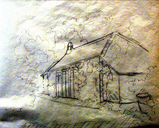
Here is the drawing on tracing paper that I wrote about the other day.  I decided to try the photo by putting white board behind the tracing paper.  It worked - sort of.  See for yourself:


It's hard to see everything, but the building itself shows up well.  All the squiggly lines you see behind the building as well as on the building indicate trees, bushes, green growing things.

This is one of three drawings that I plan to paint in watercolors, but none of them are traced onto watercolor paper.  In today's class, I told Sharon that I didn't want to spend class time on something I could do at home.  Instead of that I wanted to do a value study of this subject while she could catch me if I headed off into trouble.  She not only agreed with me, she also encouraged me to do several watercolor wash studies also.  Developing muscle memory will help be become more fluid (pun intended) with my brush work.  Since I did learn that a value study really helped with the mis-named "Painswick Gardens" (February 8, 2015 "List Lost? Forge Ahead"), I am finally willing to spend the time on studies.


Here is the value study.  It isn't finished, but it is well on its way.  Again the trees above, behind, and in front received the most attention.  I find that it is relatively easy to figure out where the shadows are on things with definite shapes - like buildings - but trees?  Well, you have to look carefully to see the masses of light and dark.  Having a sense of what's going on makes putting brush to paper a heck of a lot easier.

Or, at least, that's what I hope!

Monday, May 11, 2015

Three Drawings Ready

I told D that after a very long, hard winter, a day like today (like the last several days) is more splendid than a spring day may seem to people who live in more temperate climates.  I do believe that, but don't forget that I am also very well aware that being retired makes a HUGE difference in the way I perceive winter's woes.  I am not a Pollyanna (does anyone read those books these days?), but winter doesn't bother me as it did when I had to drive in it to get to work.

It has been just lovely:


This is the view of our side yard looking past our two flowering trees (the white one down by the road is almost invisible in comparison) to the paler pink tree in our neighbors' yard across the street.

In addition to glorying in the day, I spent a wonderful time with two friends from teaching days.  We laughed, ate lunch, reminisced, visited a bookstore, laughed some more, and simply had a grand time.  All three of us are now retired so I hope we can do this a little more often.

Once home, I managed to work on two drawings.  One is the call box (phone booth to us) from Painswick, England with the village church in the distance.  I hope I have the proportions right this time.  Before I had drawn what was in the photo, but as Sharon pointed out, it didn't make the most effective composition.  Now the call box dominates.  The other is a drawing of an outlying limestone building near Stourhead (of rhododendron fame) with super blue doors and a wonderful roofline.  While I don't think it was part of the estate we visited, it was on property nearby and caught my eye.

I can't show you either of them because they are drawn on tracing paper which is difficult to photograph well.  Why did I do that?  Well, the usual way of doing this is to draw the picture on regular drawing paper (as I did with the London Mews), then trace the drawing, and then transfer the drawing using graphite paper onto watercolor paper.  I know.  Phew!!  So I tried to make two of the compositions easier by eliminating the initial drawing stage. That's risky because as you probably realize, tracing paper is very thin and doesn't take kindly to erasures.

However, as I had actually already drawn both the call box and the Stourhead building, I felt reasonably confident that I could repeat the subject since I knew it rather well, had already made the more egregious mistakes, and now had a reasonable chance of getting it right.  

Fortunately for me, all went well.  The Mews needs to be traced, but basically I am ready for class with three drawings!

Sunday, May 10, 2015

Self-Portrait after Two Days

Showing the photograph of my self portrait before any discussion this time:


If you have ever read any science fiction or fantasy, you may remember that in order to enjoy the story, you have to "suspend disbelief".  When looking at this portrait, even though it is not a finished work that you may think will change significantly, try to believe that this is a human person.  The colors are definitely not what you would expect to see in a healthy individual, right?    If you can overlook the unusual complexion, I think you can begin to see me.  The majors parts of the face are constructed as much as possible, with a single piece of fabric.  The forehead is one piece, nose, upper cheeks, above the lip, and lower cheek areas are all single pieces of fabric assembled like a jigsaw puzzle.  We used batiks that have a number of different colors in different values within the single piece of fabric.  For example, my left upper cheek (on the right in the picture here) is one piece that changed from a dark green to mid-value blue to white to dark yellow.  That change in fabric color is what gives the face contour.

Okay, that being said, here's what I have to do with what is done so far.  I am not wearing glasses, but it looks as though I am.  I tried to construct each eye orbit with a single piece of fabric.  As Esterita Austin pointed out,there are too many shifts in value to accomplish the way I did it.  My eye area looks flat; the left eye in particular looks like the lens of a pair of glasses.  That needs to be changed.

She also told me the neck area is usually done with one piece rather than the two or three I planned on using.  I didn't think I could get the range of colors/values in one piece, but I'll look at my fabric again.  

I am happy with my mouth and teeth even though I didn't follow her guidelines with my lips.  In order for everything to work together, she wanted us to use only the piece of fabric we had (provided by her though we got to choose the one we wanted from her supply) so the face would have all the same skin tones.  If you look at the lips, you probably can tell that color would not be in my piece of material.  I cheated and took that lip color from a different source reasoning that I always wear lipstick.

My iris color will also be filched from another source.  My eyes are not skin tone (whose are?) so I have no compunction in altering Mrs. Austin's guidelines again.

Then I will go on and finish the eyeballs with iris, neck and upper shoulders, and finally the hair and shirt. The should be a lot of fun!

Wednesday, May 6, 2015

Esterita Austin Class

This was day one of the class on self-portraits with Esterita Austin.  What fun it is!  She's a low key, very helpful teacher who spends a lot of time going around to stop and check on how everyone is doing.  She has no problem helping out, giving advice when asked, making suggestions, gently reminding one about something she said 14 times that has been ignored, etc.

It is a class on self-portraits, but some have brought in photos of other dear ones to do instead.  No problem.  My idea is still the same as it was; her only comment was that it will be a large piece.  Doesn't bother me.

It will be fun to share it with you when it is further along and get your impressions.

Tuesday, May 5, 2015

How to Feel Good

I wish we could sit down, have a cup of whatever suits us, and just chat about what's going on in our lives.  Today was a good day, and I'd love to share it with you.  Think about it . . .

While at painting this morning, I worked on drawing the second of the two scenes from England that are in the planning stages.  Yes, I started the first drawing two weeks ago, and this new one isn't close to being finished, but I still feel a sense of accomplishment.  That's what makes today a good day.  Small steps are still steps in the right direction.

"So," you ask, "what happens if the work you did today turns out to be awful and has to be discarded? Where's the right direction now?"  

The direction isn't the quality of the work.  It's the fact that work was done that makes it important.  The next time the work may be even worse or it may be better but either way is okay.  

Each time we manage to sit down and put thought, time, and effort into our art is time hugely well spent.  We wind up feeling so good that we're eager to talk about it, do more work, share the sense of accomplishment, offer a listening ear and encouragement to others so they, too, can get to work and wind up full of a sense of well-being.

How does that chat sound now?

Have a great day working on your art!

Monday, May 4, 2015

Words to Live By

At Quilt Camp, Maria brought in "Words to Live By" to work on.  This wool and fabric quilt came as a kit that was sold locally and was very, very popular.  I think Maria's is only the second one that I have seen completed.  In the spirit of full disclosure I have to admit that I, too, purchased the kit but haven't even begun work on it.  I began by changing the backgrounds, collecting some different colors for the flowers, birds and other motifs (but not all of them!), and wondering what phrases could replace the ones in the pattern.  In short, I shouldn't have purchased the kit!

Okay, that's the odd kick in my gallop which does NOT affect my pleasure in Maria's quilt or appreciation of the beauty of this quilt.  See what you think:


Maria, this is gorgeous and the work you have done is superb!


Sunday, May 3, 2015

Air Plant

ME and I went to Quilt Camp this weekend, and we were both able to accomplish a lot.  I didn't take photos this time - well, I did take one which I'll share later, but there were people there doing amazing work!  

Once home again, more headway was made, and for the moment anyway I feel that everything is under control. I spent a bit of time reading before undertaking the Sunday-watering-of-the-plants routine.  Look at what I found!


This is one of the air plants D"s sister N gave him for his birthday.  While I was watering the fern plant in which this one nestles (and the two Tillandsias* behind it), I realized this one is in bloom!  I think the flowers are the lovely purple buds you see along the red flower stalk.   Look at the very end of the purple flower at the tip.  See where it has opened up and the yellow stamens are poking out?  Really neat.

Enjoy your day!

*  "Tillandsia, more widely known as air plants, make up the largest genus in the bromeliad family, encompassing more than 600 species."

from Air Plants: the Curious World of Tillandsias by Zenaida Sengo.  (p 20)